Lately, I’ve been having some issues with my current logo (particularly the logo type) specially when it comes to its “uniqueness”. It’s also my fault as the “designer” since I really didn’t spend too much time in making it “unique”. What I did is I just used one of my favorite font that I’ve been using for years and just directly typed the “Otakumouse” name on it which is really a bad design practice. (And yep, I’m a designer :P).

Over the course of 3 months, I discovered 5 websites using the same font. The funny thing about that discovery is 2 of them are porn sites lols. If you’re wondering what the font is, it’s called “Slant” and it’s been around for years. I told myself at first that “Nah, it’s ok…” but then even Danny Choo noticed that the font I used was similar to the font used in the very popular site, Tokyo Otaku Mode.
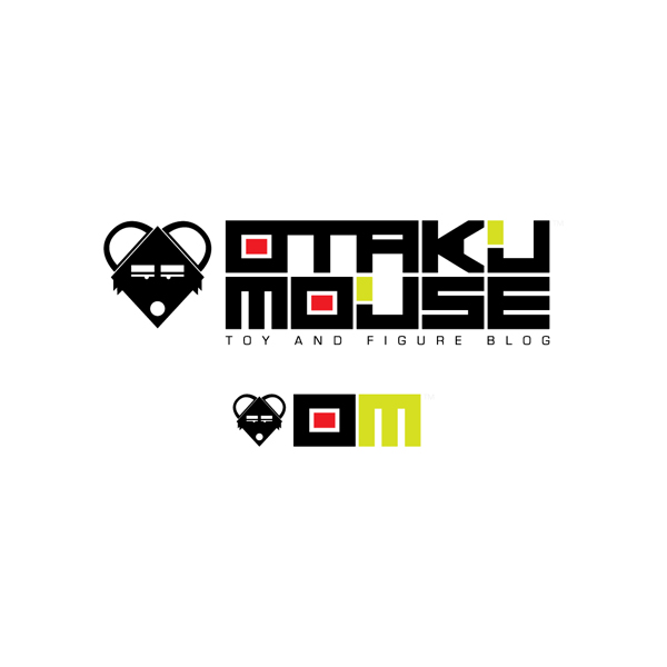
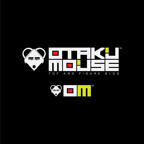
That’s the time I decided to re-create and re-brand my logo from scratch and I made sure that it’s unique in every way. Hope you like the new look :)

